Hi class,
As we all decided together last class, we're having a quick in-progress critique on Monday and our final critique on Wednesday, October 1st.
See you all on Monday and have a good weekend!
.
Thursday, September 25, 2008
Tuesday, September 23, 2008
Poster::Due date
Hi class,
Our critique is not going to be on this Wednesday. We moved the date to Monday, September 29th.
See you tomorrow!
.
Our critique is not going to be on this Wednesday. We moved the date to Monday, September 29th.
See you tomorrow!
.
Tuesday, September 16, 2008


One word:::Concept
Answer the question to yourself:
(name of the play you chose) is about_____(one word)____________________.
(name of the play you chose) is about_____(one word)____________________.
(name of the play you chose) is about_____(one word)____________________.
Try to narrow the story down to one or three words (that can be used as your concept).
Think how you can convert that concept into an image in your poster.
Make your poster unique. Make your poster original. Make your poster memorable
.
(name of the play you chose) is about_____(one word)____________________.
(name of the play you chose) is about_____(one word)____________________.
(name of the play you chose) is about_____(one word)____________________.
Try to narrow the story down to one or three words (that can be used as your concept).
Think how you can convert that concept into an image in your poster.
Make your poster unique. Make your poster original. Make your poster memorable
.
Poster design ::: Please consider
Consider some aspects of your poster:
1. Balance
- Perceptual forces;
- Visual weight;
- Direction;
- Top and bottom;
- Right and left;
2. Competing aspects
3. Symbolisms
- Visual interpretations/codes
4. Shape and color
5. Shape and color
6. Color palette
- Interaction of color
- Reactions to color
- Cold and warm
.
1. Balance
- Perceptual forces;
- Visual weight;
- Direction;
- Top and bottom;
- Right and left;
2. Competing aspects
3. Symbolisms
- Visual interpretations/codes
4. Shape and color
5. Shape and color
6. Color palette
- Interaction of color
- Reactions to color
- Cold and warm
.
Saturday, September 13, 2008
logo + utilitarian
Just a reminder:
The logo + utilitarian is a stretch of your original logo thus it must be your logo plus another cohesive element.
.
The logo + utilitarian is a stretch of your original logo thus it must be your logo plus another cohesive element.
.
Wednesday, September 10, 2008
Personal logos_What to bring on Monday, Sept 15
This is a reminder of what you have to bring to class on Monday:
ONE mounted board, 11" x 17"
BW and color just type logo (side by side)
ONE print not mounted, 8.5" x 11"
Logo with utilitarian color
ONE print not mounted, 8.5" x 11"
Logo with utilitarian BW
ONE print not mounted, 8.5" x 11"
With your "fake" business card, which should be 2" x 3.5"
(Put your logo, name, phone number and e-mail address in the card)
Also, create a document with the following information about your logo. It must be attached on the back of your board:
Personal logo
1. Define your logo in one word (concept)
2. Description of logo
3. Description of logo utilitarian
4. Explain your font choice
5. Explain the color/colors you used
It doesn't have to be long - actually, one paragraph is enough for each one of the sections. Remember that justifications like "I like it" and "It's my favorite color", for example, should be avoided. You must be able justify your choices through a more logical way.
.
GrD terms
SOME IMPORTANT TERMS IN GRAPHIC DESIGN:
http://www.graphicdesigndictionary.com/
Alias
When the curves and other lines in a graphic becomes jagged, the resolution of the graphics file is too low. The graphic is then referred to as "aliased".

Alignment
The align command is used to adjust the position of objects or text in relation to each other. The various ways objects or text can be aligned are typically left, right, center, top and bottom.
Anti-alias
Softening of the jagged edges in images that have become aliased.

bitmap (BMP)
Bitmap images are resolution dependent, unlike vector graphics which are resolution independent. A bitmap does not need to contain a bit of color-coded information for each pixel on every row. It only needs to contain information indicating a new color as the display scans along a row. This means that an image with much solid color will tend to require a small bitmap.
bleeding
When an image or printed color extends beyond the trimmed edge of a page, it is called a "bleed". Bleeding ensures that the print extends to the edges of the paper. The paper is usually trimmed to the desired size after printing.
canvas size
The full area of an image.
CMYK
CMYK stands for Cyan, Magenta, Yellow and Black, the four process color inks.

comp (comprehensive)
Comp's are made to see what a prospective design project will look like for example the layout of the image, use of color, the size and the paper that will be used. It is also named a dummy.
DPI (dots per inch)
DPI is the number of dots (or pixels - PPI) that fit horizontally and vertically into a one-inch measure. The more dots per inch, the more detail is captured and the sharper the image.
duotone
Duotones are made by printing an image with two colors, usually black and a second color. The resulting image has more depth than it would have had with only a monotone color (mostly black ink on white paper).
dummy
A dummy counts as an example of a piece of design work (brochure, ad, book cover etc.) that needs to be approved by the client. Once the client approves the dummy, the designer creates and prints the final design.
feathering
A graphic software tool used to make the edges of an image appear blurry.
font
A font is a complete set of characters in a particular style and typically consists of a full letter set, number set and all other special characters you get by pressing the shift, control or option keys. Examples of fonts include "Arial", "Courier New" etc.
GIF (Graphics Interchange Format)
GIF images display up to 256 colors. GIF images generally have very small file sizes and are the most widely used graphic format on the web. The low quality resulting from compression makes them unsuitable for professional printing.
gradient
A function in graphic software that allows the user to fill an object/image with a smooth transition of colors, for example a dark blue, gradually becoming lighter or red, gradually becoming orange, then yellow.

hue
Hue is the actual color of an object. Hue is measured as a pure color (on the color wheel) in degrees, for example degrees/variations of blue which is from a green-blue or sea-blue up to a purple-blue.
JPEG (Joint Photographic Electronic Group)
A common compression method that shrinks a file's storage size by discarding non-important picture detail. Excessive jpeg compression can cause poor image quality.
kerning
Adjusting the lateral (horizontal) space between letters.
vector graphic
Vector graphics are drawn in paths. This allows the designer to resize images freely without getting pixilated edges as is the case with bitmapped images. The vector format is generally used for in printing while the bitmap format is used for onscreen display.
.
http://www.graphicdesigndictionary.com/
Alias
When the curves and other lines in a graphic becomes jagged, the resolution of the graphics file is too low. The graphic is then referred to as "aliased".
Alignment
The align command is used to adjust the position of objects or text in relation to each other. The various ways objects or text can be aligned are typically left, right, center, top and bottom.
Anti-alias
Softening of the jagged edges in images that have become aliased.
bitmap (BMP)
Bitmap images are resolution dependent, unlike vector graphics which are resolution independent. A bitmap does not need to contain a bit of color-coded information for each pixel on every row. It only needs to contain information indicating a new color as the display scans along a row. This means that an image with much solid color will tend to require a small bitmap.
bleeding
When an image or printed color extends beyond the trimmed edge of a page, it is called a "bleed". Bleeding ensures that the print extends to the edges of the paper. The paper is usually trimmed to the desired size after printing.
canvas size
The full area of an image.
CMYK
CMYK stands for Cyan, Magenta, Yellow and Black, the four process color inks.
comp (comprehensive)
Comp's are made to see what a prospective design project will look like for example the layout of the image, use of color, the size and the paper that will be used. It is also named a dummy.
DPI (dots per inch)
DPI is the number of dots (or pixels - PPI) that fit horizontally and vertically into a one-inch measure. The more dots per inch, the more detail is captured and the sharper the image.
duotone
Duotones are made by printing an image with two colors, usually black and a second color. The resulting image has more depth than it would have had with only a monotone color (mostly black ink on white paper).
dummy
A dummy counts as an example of a piece of design work (brochure, ad, book cover etc.) that needs to be approved by the client. Once the client approves the dummy, the designer creates and prints the final design.
feathering
A graphic software tool used to make the edges of an image appear blurry.
font
A font is a complete set of characters in a particular style and typically consists of a full letter set, number set and all other special characters you get by pressing the shift, control or option keys. Examples of fonts include "Arial", "Courier New" etc.
GIF (Graphics Interchange Format)
GIF images display up to 256 colors. GIF images generally have very small file sizes and are the most widely used graphic format on the web. The low quality resulting from compression makes them unsuitable for professional printing.
gradient
A function in graphic software that allows the user to fill an object/image with a smooth transition of colors, for example a dark blue, gradually becoming lighter or red, gradually becoming orange, then yellow.
hue
Hue is the actual color of an object. Hue is measured as a pure color (on the color wheel) in degrees, for example degrees/variations of blue which is from a green-blue or sea-blue up to a purple-blue.
JPEG (Joint Photographic Electronic Group)
A common compression method that shrinks a file's storage size by discarding non-important picture detail. Excessive jpeg compression can cause poor image quality.
kerning
Adjusting the lateral (horizontal) space between letters.
line weight
Line weight is a term referring to the thickness of a printing line. Sometimes shapes are drawn with a line weight of zero and then the fill color is used to define the shape.
opacity
The density of a color or tonal value. The opacity of an image or object can range from transparent (0% opacity) to opaque (100% opacity). The ability to edit the opacity of individual objects allows the designer to create images that seem to flow into and through one another.
page layout
An example of a page layout is the pages in magazines or brochures. Every single page layout was created on a blank page by placing text, text columns, images etc. on the page. The whole design of a single page in a magazine is a page layout.
pixel
The smallest picture element (used to display an image on a computer), that can be independently assigned a color.
resolution
The resolution of an image is an important factor in determining the attainable output quality. The higher the resolution of an image, the less pixilated it will be and the curves of the image will appear smoother.
RGB (Red, Green, Blue)
RGB is the model used to project color on a computer monitor. By mixing these three colors, a large percentage of the visible color spectrum can be represented.
royalty-free photos or images
Intellectual property like photos and graphic images that are sold for a single standard fee. These can be used repeatedly by the purchaser only, but the company that sold the images usually still owns all the rights to it.
text wrap
A term used in page layout software, referring to the way text can be shaped around the edges of images.
vector graphic
Vector graphics are drawn in paths. This allows the designer to resize images freely without getting pixilated edges as is the case with bitmapped images. The vector format is generally used for in printing while the bitmap format is used for onscreen display.
.
Project #2 ::: Poster design
POSTER DESIGN
DUE DATE: 09/24/08
THE CONCEPT
Focus, delivery, continuity, creativity and presentation are the essentials of what a poster design encompasses within the realm of visual communication. The success in designing a theatrical event poster depends on, not only the understanding what purpose the content of what the poster depicts, but also understanding the target audience.
THE THEATRICAL POSTER CONTENT
You can choose one play from the provided list below to create your poster. It's vital that you familiarize yourself with the theatrical play. RESEARCH the choice you made and then write a brief synopsis of the key elements and plot/subplot points including a brief description of the characters.
Distill, to the best of your ability, the emotional crux and meaning of the play and design a poster reflecting in a very contemporary/modern fashion way the meaning which you discovered. (Traditional or ancient plays should be reinterpreted and presented for a modern audience). Posters should be interesting and unique, typographically strong and readable from a distance (although they will never become a business card =). All the elements of who, what, where and when should be presented as well as the play.
Text type (body copy) will be discussed in class, but here's part of the information you will use:
Where: The Fabulous Fox Theatre
When: September 24th - November 24th
The who, what, where and when is the usually the necessary information along with the event logo you design as well as the logo of the Fox Theatre.
THE CHOICE
Knowing your subject and imagery is crucial to the success of your design and delivery. Research is required and will be discussed in class individually before the actual design begun. The ability for you to create your own images through photography, illustration, paintings/drawings, collage, etc, is the key to this project. A successful approach will implement broad graphic design stylizations of subject matter along with a creative solution to using type (type works as an image and as information).
FINAL PRESENTATION
Each poster should be a full bleed 10.75" x 16.75" print mounted on white board.
Here's the list of the shows you can choose to design your poster:
1. Phantom of the opera - Heath
2. Grease
3. The little mermaid - Vicky
4. Les misérables
5. My fair lady - Jessica
6. Beauty and the beast
7. Chicago - Gazula
8. The lion king - Anjeli
9. Mamma mia!
10. Legally Blond - Barrom
11. The producers - Maddy
12. Hairspray - Lanadia
13. Hair - Rory
14. Evita
15. Dreamgirls - Lauren
16. The sound of music - Sarah Kim
17. Amadeus
18. The Seven Year Itch
19. Grand Hotel
20. Sunset Boulevard - Sarah Mallard
21. Dracula - Justin
22. West side story - Shane
23. Mary Poppins - Cristy Lee
22. The Color Purple - Lizette
23. MacBeth - Jon
24. Xanadu
25. The King and I
26. A Streetcar Named Desire
27. Camelot - Brent
28. Kiss of the Spider Woman
29. Rent - Katie
30. Shrek - Robert
31. Around the world in 80 days
32. Dirty Dancing - Miandra
* All plays listed above are also movies, however, you will be designing posters for plays.
** The more you investigate the story behind each play and get to know the play, the better your design will be.
.
Tuesday, September 9, 2008
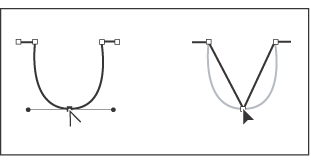
Useful tip: Converting anchor points
Converting anchor points
The Convert Anchor Point tool lets you change corner anchor points to smooth anchor points, and vice versa.
To convert between smooth points and corner points:
1. Use the Direct Selection tool or the Lasso tool to select the path you want to modify.
2. Select the Convert Anchor Point tool.
3. Position the Convert Anchor Point tool over the anchor point you want to convert, and do one of the following:
- To convert a corner point to a smooth point, drag a direction point out of the corner point.

Dragging a direction point out of a corner point to create a smooth point
To convert a smooth point to a corner point without direction lines, click the smooth point.
Clicking a smooth point to create a corner point
To convert a corner point without direction lines to a corner point with independent direction lines, first drag a direction point out of a corner point (making it a smooth point with direction lines). Release the mouse button only (don't release any keys you may have pressed to activate the Convert anchor point tool), and then drag either direction point.- To convert a smooth point to a corner point with independent direction lines, drag either direction point.
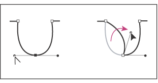
Converting a smooth point to a corner point
.
Saturday, September 6, 2008
How to label your files
You all need to give me a cd or dvd with absolutely all designs you created during the semester (even the ones you didn't use/submit, your drafts, everything). So in order to have everything well organized, here's how you're going to label your files:
1. Create individual folders:
Eg: Project 1_GRD 3000_Personal logo
Project 2_GRD 3000_Poster
Project 3_GRD 3000_Book jacket
Project 4_GRD 3000_Package
Project 5_GRD 3000_Brochure
2. Name the files in each of the folders as follows:
GRD 3000_FIRST NAME_LAST NAME_Personal logo 01_DRAFT.
GRD 3000_FIRST NAME_LAST NAME_Personal logo 02_DRAFT.
And so on.
GRD 3000_FIRST NAME_LAST NAME_Personal logo FINAL.
Please be organized. Remember that it can always make a difference in your grade.
.
Adobe programs trials
Hi class,
In case you need, you can download trial versions from the Adobe website.
http://www.adobe.com/downloads/
To finish this post, a quote:
.
In case you need, you can download trial versions from the Adobe website.
http://www.adobe.com/downloads/
To finish this post, a quote:
"When you feel like giving up, remember why you held on for so long in the first place."~ Unknown
.
Thursday, September 4, 2008
Personal logos_Boards
Hi class,
Just a reminder about printing and boards:
- Prints on 11x17 inches paper. (two 8.5x11 put together on a board won't be accepted)
- 2 boards (white prefered) with the same two images:
1. Logo, just type + Logo, type and accessory (black and white)
2. Logo, just type + Logo, type and accessory (color)
- Board must be perfectly mounted. Keep it clean. Keep it neat.
Use spray adhesive, x-acto knife and ruler.
- Write name, course #, semester, class time and instructor name on the back. (bottom right)
- Use a more professional kind of paper. Presentation paper - Matte or semi-glossy (not glossy) is recommended. Regular paper shouldn't be used.
Craftsmanship is extremely important and you'll be graded on that as well.
Be ready to defend you concept (say your whys - in graphic design everything must be explained, nothing is random).
* Samflax has a good deal on paper. I got this paper there to print some designs and I'm satisfied with it. Also, the price was better than Epson's. Click here to see it.
** These special papers have 2 different sides, so look for the correct side to print. It's usually the whiter one.
*** You can use the Creative Media Center (CMC) located in the A&H Bldg, room 460 to print. You can also go to Staples, Kinko's, etc.
.
Subscribe to:
Comments (Atom)